Since 1984 Palliative Care South East (originally South East Palliative Care) has provided support to those with a life-limiting illness, their carers and their family members. They are committed to enhancing the care provided at home, by providing comprehensive, collaborative, integrated care and specialist support.
Embarking on a new strategic direction, Palliative Care South East (PCSE) commissioned Ivory Design to develop a new identity to reflect their goals and direction. PCSE aim to achieve a stronger profile in the community, to develop long-lasting partnerships with allied health services, and to increase fundraising and support to grow their scope of services to continue to support their community’s evolving palliative care needs.
We approached the identity redesign by researching and investigating various cultural and religious beliefs around death and dying. We found that no matter what background you came from, religion you believed in, or cultural traditions that you held, there was the common theme that “death is not the end, but rather, “taking the next step to eternal happiness.”
The design team explored values and themes aligned to innovation, empowerment, honesty, celebration, enablement, support, respect, integrity and boldness.
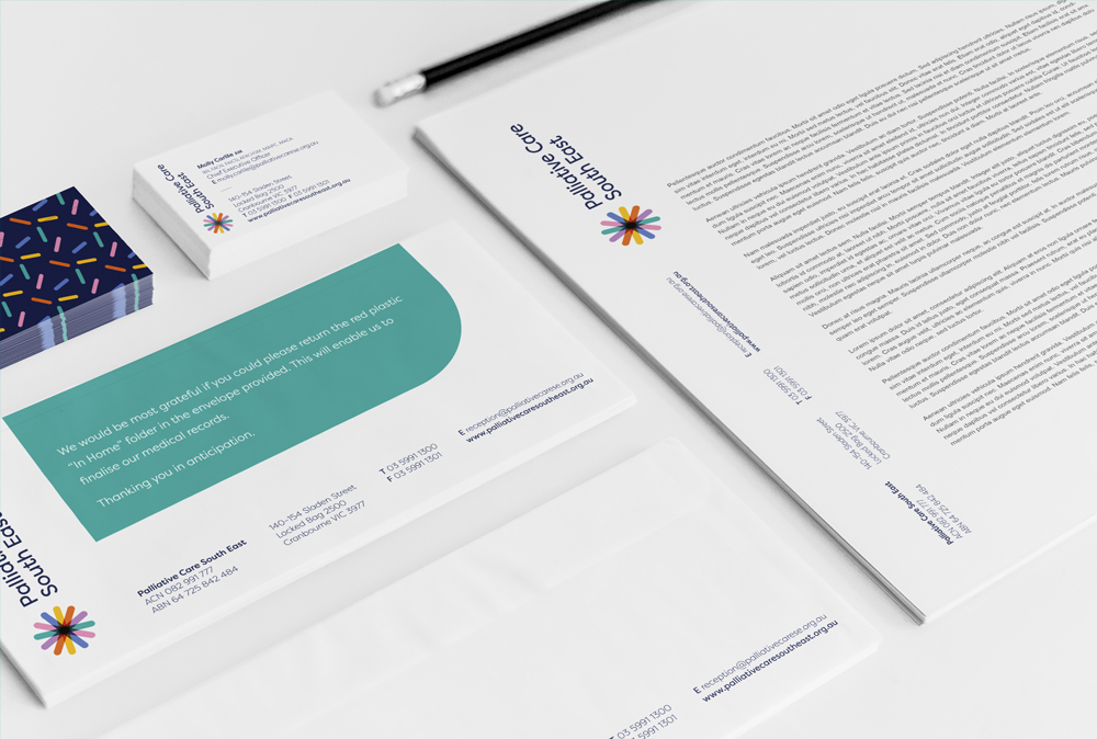
The logo’s uniform shapes come together to form a support network that is representative of cultural respect, the circle of life and holistic care. The shape is also moving forward, representing the organisation’s innovation and forward-thinking values.
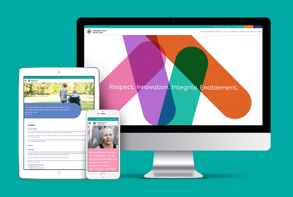
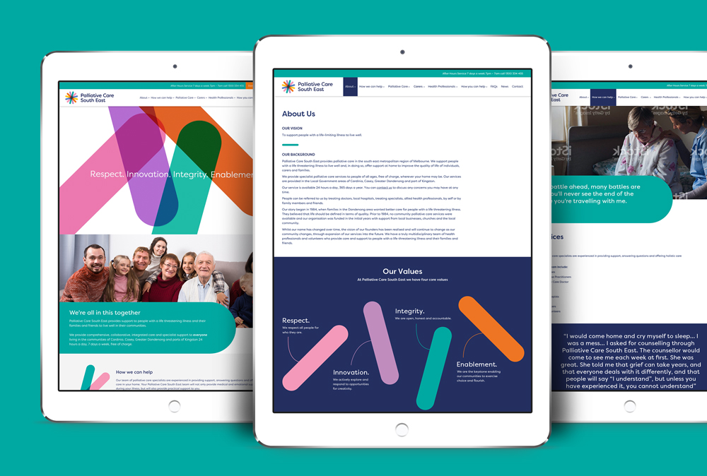
A bold and celebratory colour palette was developed to further convey positivity, innovation, empowerment and enablement. The curved and soft edges of the typography are reflective of the shapes within the icon device. It’s simple, friendly and approachable without being “too medical”.
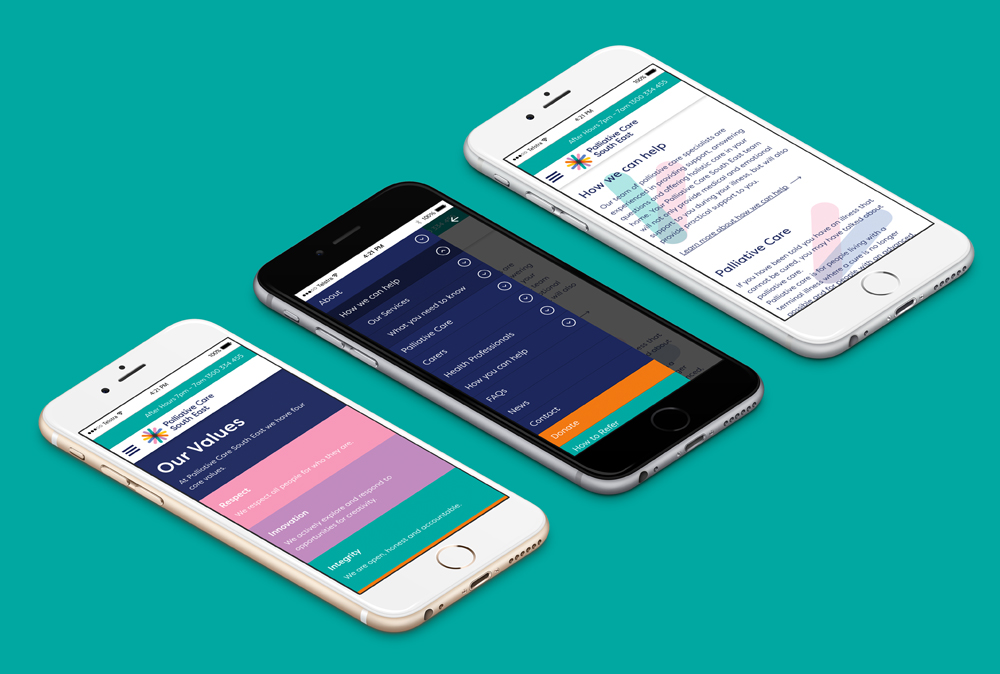
We couldn’t be more proud of this rebrand. Once the new logo design was signed off it’s been all hands on deck to complete the full rollout. We have designed and built PCSE’s new responsive website, full suite of stationery, brochures, a video animation, identity guidelines and signage.


 Back To All Posts
